BY MATTHEW BIRCHARD
Fun fact: the colors on your computer screen are not the same as the colors you see in print. Really. Here’s a quick overview of the types of color and what it means for working with a marketing agency.
You may have heard of RGB or CMYK and even PMS with reference to color, but these acronyms can be glossed over. Most people think colors are all the same, regardless of media or medium; that orange is orange is orange. Right? Well, think again.
Turns out, the color space, or the color model being followed, changes from what you see on your screen to the proof that your printer gives you. Colors also vary from printer to printer, and from one computer screen to the next. Graphic designers earn their keep keeping colors straight so that your business’ branding remains consistent across all executions of your brand, from web to packaging, signage to ads. Your orange has to look just right so your customers don’t mistake it for a competitor’s orange.
Color is defined most commonly in one of three ways, that being RGB, CMYK or PMS. Having a basic understanding of each will help guide you when working with your full service marketing agency or other marketing and production vendors. Following is a quick breakdown of the three. And while you may encounter some variations (sRGB for instance) or additional outliners (RAL color space if you’re working in Europe), these three are well understood by most professionals in the industry.
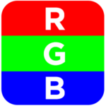
RGB COLOR SPACE:
RGB (R=RED, G=GREEN, B=BLUE): Anything that is viewed on a screen, such as televisions, computers, or mobile devices uses a RGB color space. The images on a screen are made up of red, green and blue pixels, and the light that screens emit behind those colored squares (pixels) produces a spectrum of colors that we see. Each color is defined by a numerical value of red, green and blue, and you may see it described as R: 236, G: 107, B: 33, which equates to a dark orange color that Rains | Birchard Marketing uses in our branding. However, the RGB color model is device dependent, meaning the way colors are displayed on a screen depends on the hardware used to display it. That’s why colors will look differently on your computer than on mine. Professional design programs such as Adobe’s Creative software, include calibration software to tune your monitor to an accurate display. Higher-end monitors also can include calibration abilities, and this ensures that you can maintain color accuracy when working on design projects.
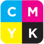
CMYK COLOR SPACE:
CMYK (C=CYAN, M=MAGENTA, Y=YELLOW, AND K=BLACK): Anything that is used for print, such as business cards, brochures, flyers or magazine advertisements uses a CMYK color space. In this printing process, color is produced by mixing the four separate ink colors. You only need these four colors to reproduce photographs and other graphics. And if you look at printed materials under magnification, you can often distinguish the different color ink dots on the paper. CMYK colors are defined by percentages, so the dark orange used in my brand is defined as: C: 2%, M: 66%, Y: 98%, K: 0%. Also referred to as “process color” or “four color process”, CMYK is the way all color printing is done, except for when you use PMS (see below).

PMS COLOR SPACE:
PMS (PANTONE MATCHING SYSTEM): The industry standard for matching colors exactly the same way on every thing you print, no matter what. Pantone is a company and they literally control color. Using the PMS color, you can match your exact orange in print, in textiles, in plastics, in paint, in you name it. It’s quite fascinating actually. Each of the nearly 2,100 standard Pantone colors have a unique code for reproduction; for example PANTONE 158 C is the dark orange color Rains | Birchard Marketing makes frequent use of. When printing, each Pantone color gets its own specific printing plate, making the colors more vibrant than CMYK. Pantone even offers metallics and fluorescents, which cannot be reproduced with CMYK process color printing. When your marketing agency or designer creates you a logo or branding guideline, they will invariably define PMS colors for you.
What all this means, is you need to know how colors will be used to know what color space to use them in. A qualified full-service marketing firm will be staffed with graphic designers that live and breath this stuff. Trust these experts so that you get consistency in your use of color. You should know what your PMS colors are for your brand, along with their RGB and CMYK definitions (if they are compatible). Color is a key design element and brand asset, and maintaining consistency should be a goal your marketing agency can support.
Looking for guidance or just need to bounce an idea off someone new? Contact Matt Birchard directly at: 503-297-1791 ext. 1 or via email.